Adirondack Exp
Adirondack Experience is an organization within the Adirondack mountains which prioritizes a safe and fulfilling experience for all their travelers. The organization have funded wayfinding systems and tracking apps complete with an itinerary so travelers are always connected and stay on track.
#039691
#e1542c
#ffffff
#0a0a0a

Hiking towards solution
Adirondack experience needed a recognizable mark to use on clothing and signage. The chosen route features a circular mark which is ideal for trail markers. The center of the mark has a subtle "AM" monogram made using the linear form of mountains. The center creates a diamond which is iconography used to identify the peak of a mountain.The primary color is a forest teal which is ideal for nature-centric organizations. Complimentary to this is an orange which is used to provide contrast helping travelers stand out and make trail markers more visible to hikers.


Adirondack Experience built a wayfinding system for both trails and waterways. This system utilizes more durable materials to replace the existing wooden signage system that has worn down over time.

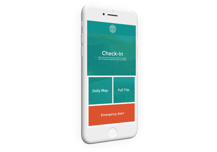
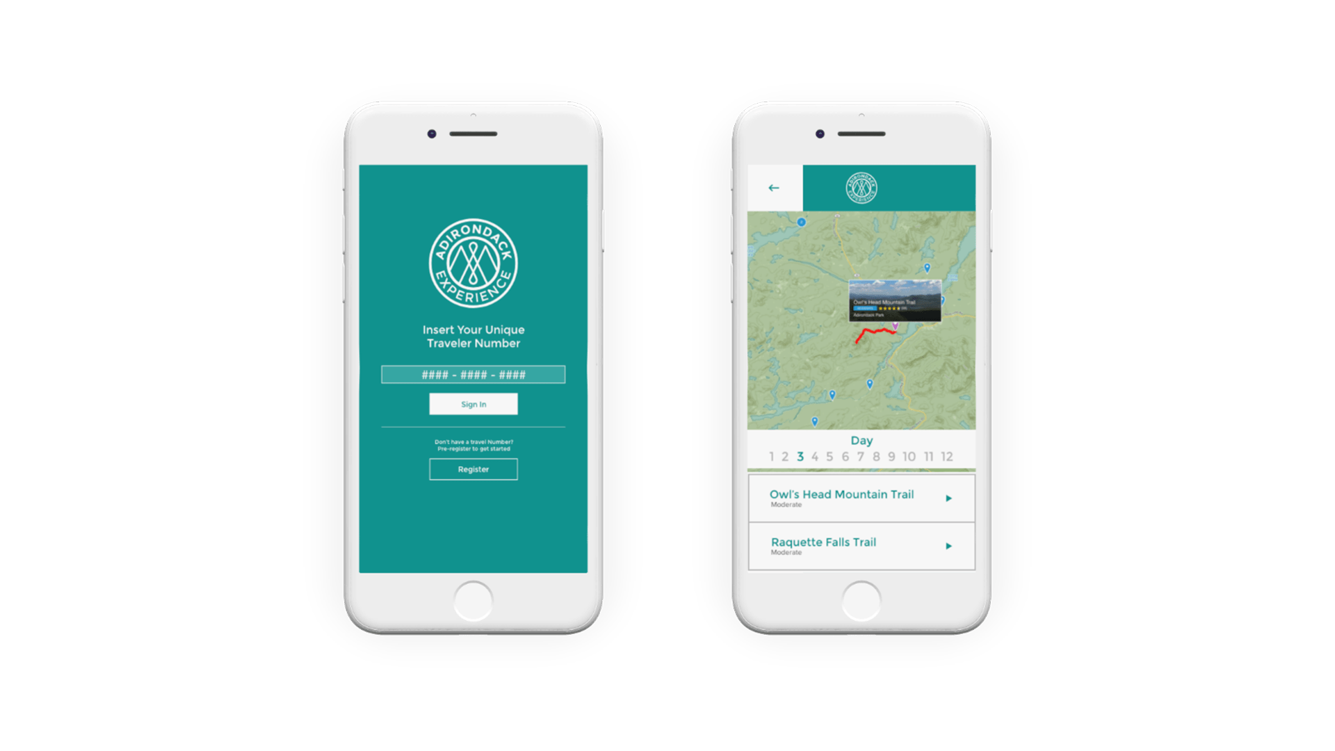
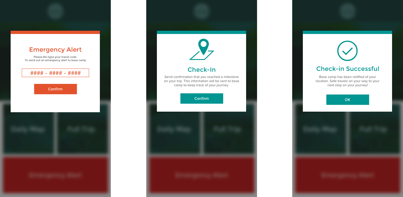
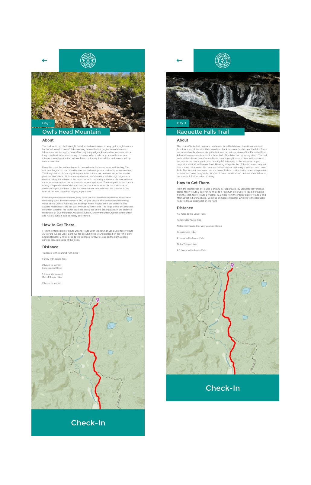
People who travel with Adirondack Experience are equipped with a mobile application to ensure traveler safety.
