Babushka’s
Project Brief
Babushka's Premium Jam focuses on the culinary tradition of home-made jam as it exists within the slavic region and upscales it to better fit within a higher end market. Babushka's targets middle aged men and women with a particular taste for quality. Babushka's needed a strong logo paired with high-end packaging and an elegantly crafted website to build credibility within their target market.

#e0bb70
#3c3c3c
#ffffff

Boiling down the specifics
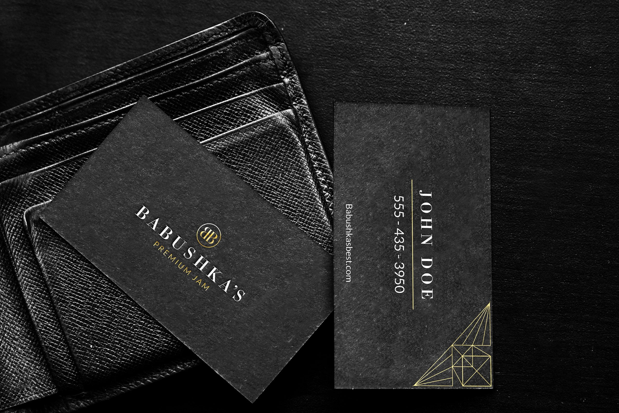
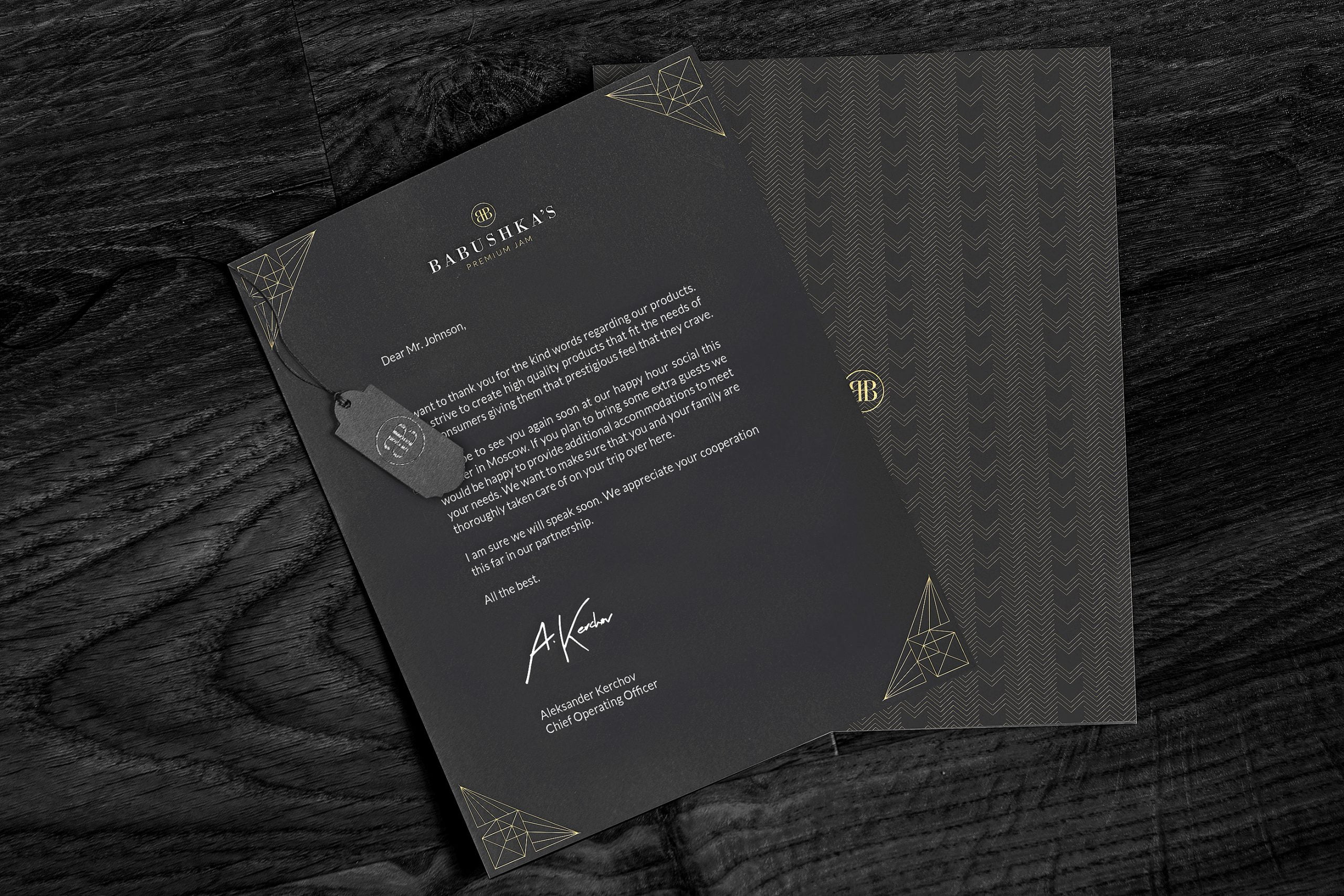
Breaking down the brand into one word "Simplicity". The Identity needed to feel refined, clean, and elegant. For this, the primary mark is a mirrored 'B' monogram paired with a classic serif typeface. Using a sans-serif as the subhead we can draw a modern element to an otherwise traditional product.
Breaking down the visual elements, we see patterns inspired by Russian art deco style which can be found in Moscow. A simple black, white, and gold palette further accentuates a luxurious visual experience.

Packaging
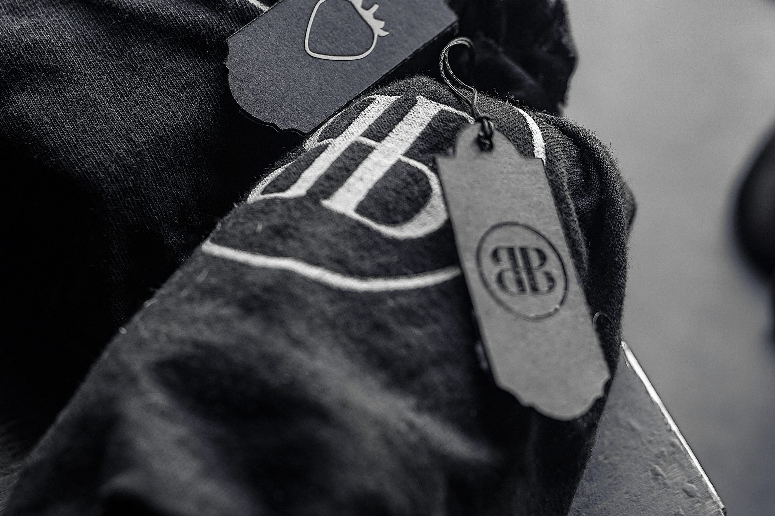
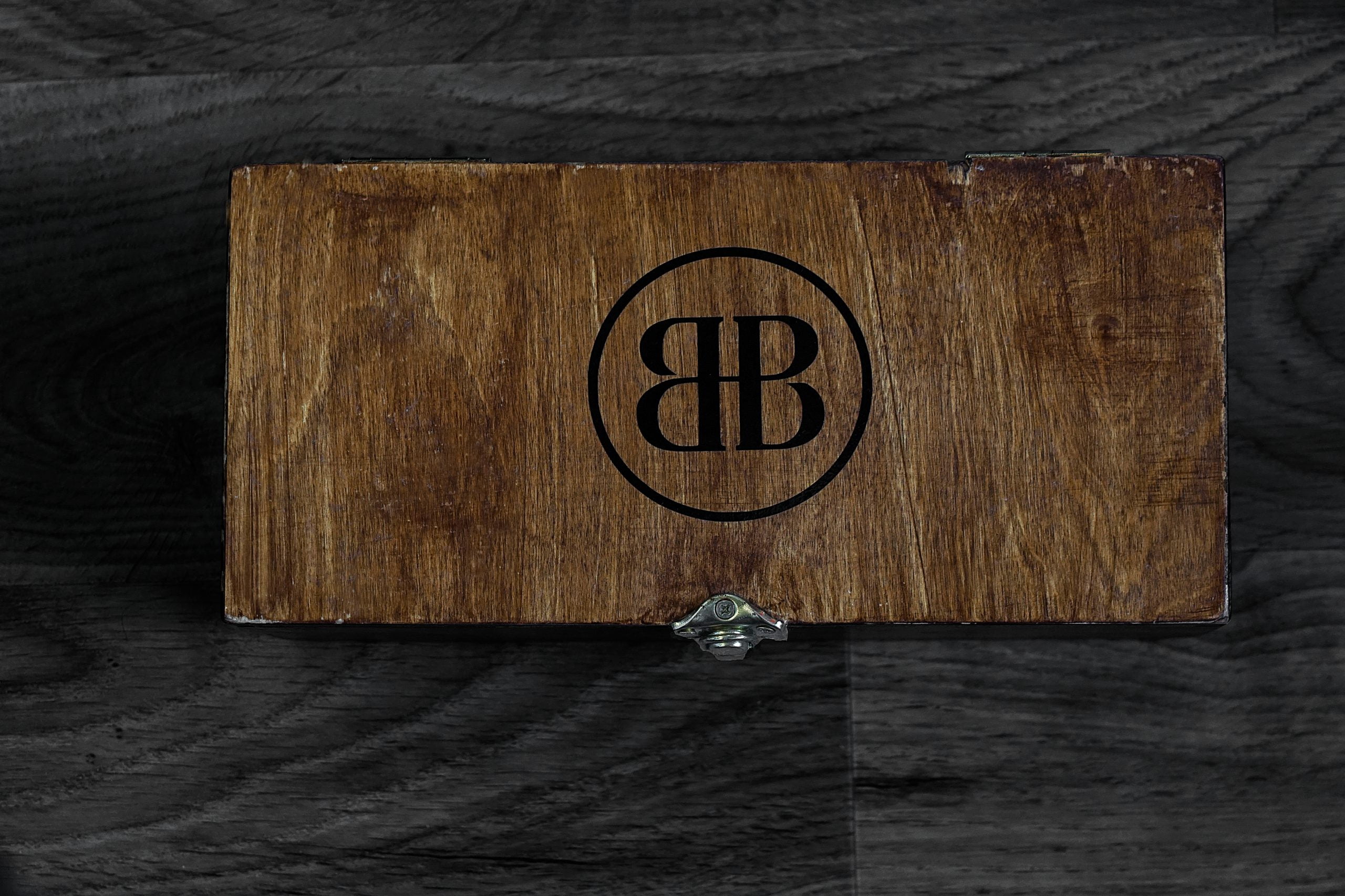
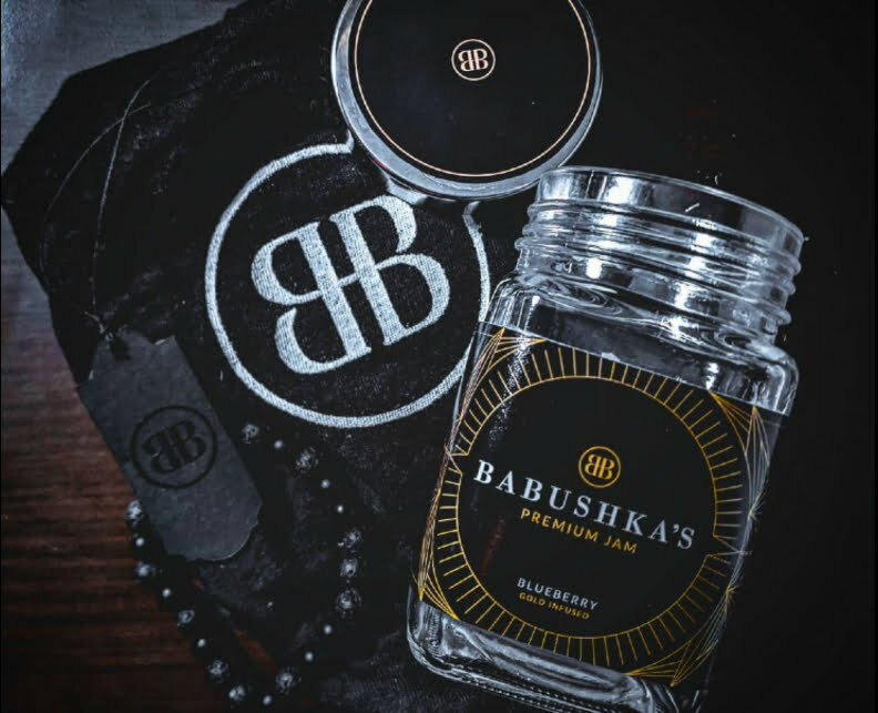
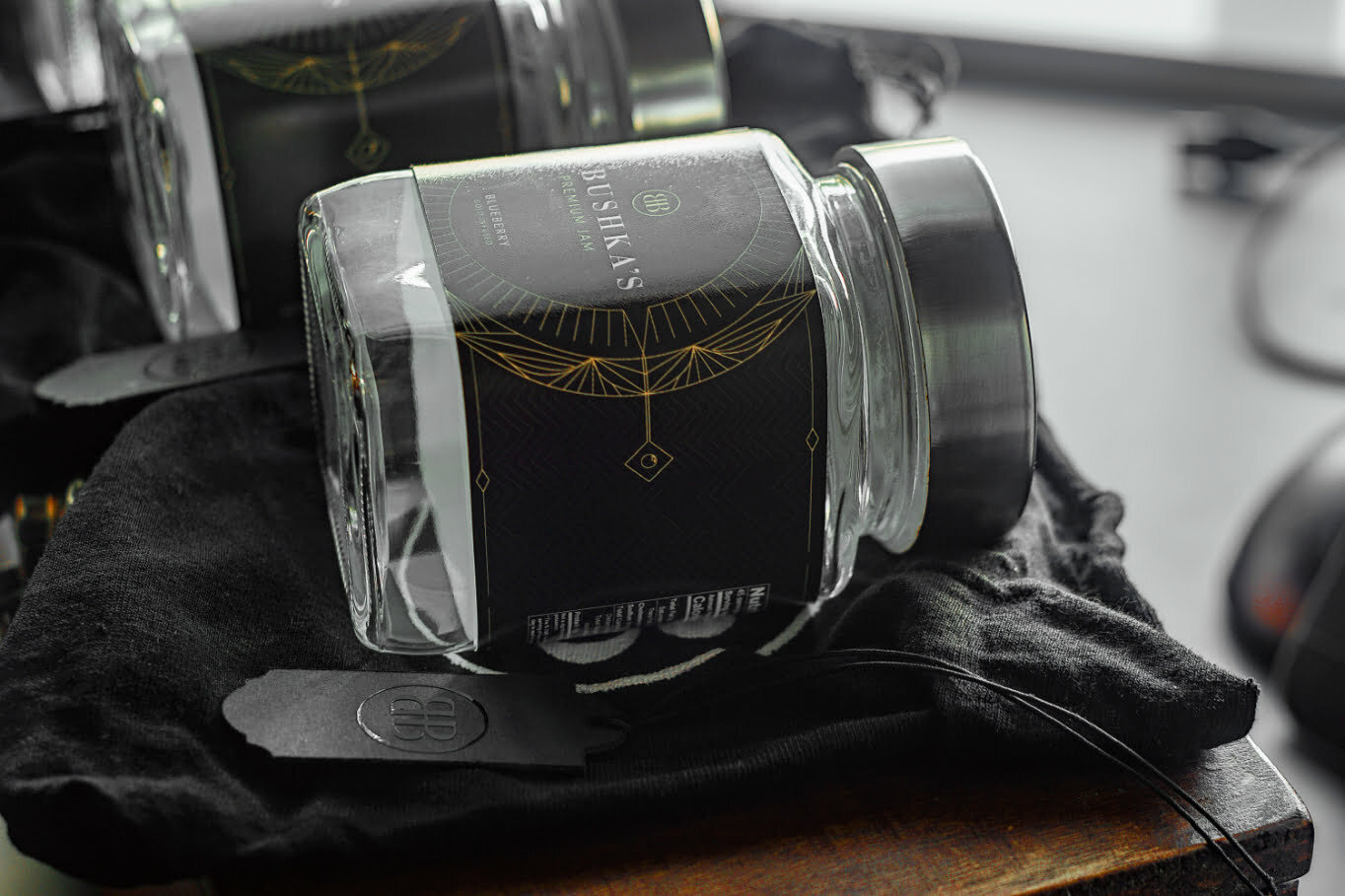
To provide a truly unique experience, all jars are shipped inside a hand-made wooden box fastened with brass hardware. The jars come inside a dust bag tied at the top with a hang tag identifying each individual flavor. These are carefully placed in the box surrounded by a silk lined foam for optimal protection.Opening the bags you will find the jars with the logo on the lid and Russian art deco inspired patterns across each jar's label with subtle details identifying the flavor.


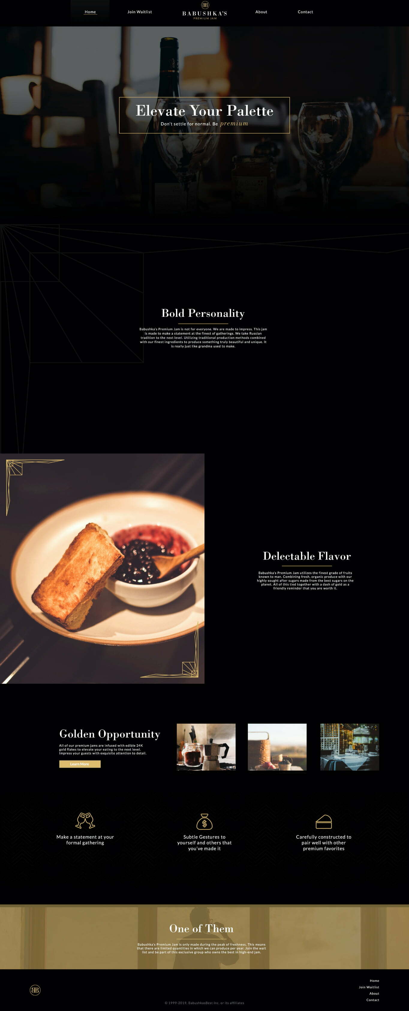
Website
The website maintains the simple, elegant, motif seen throughout the identity and acts as a primary resource for users to find information on the brand and join the waiting list.