Courier
Courier Chocolates is a bespoke chocolate company sending flavors based on the consumers unique taste. Each package is curated monthly and sent to the consumer. Courier prioritizes clean, ethically sourced, materials using environmentally friendly processes to ensure a refined high quality product. Courier was in need of a full brand design and it is essential that their identity, website, and packaging captures their values of clean, refined, and organic.
#df6452
#afced0
#2a3c54
#ffffff
Sweeten the specifics
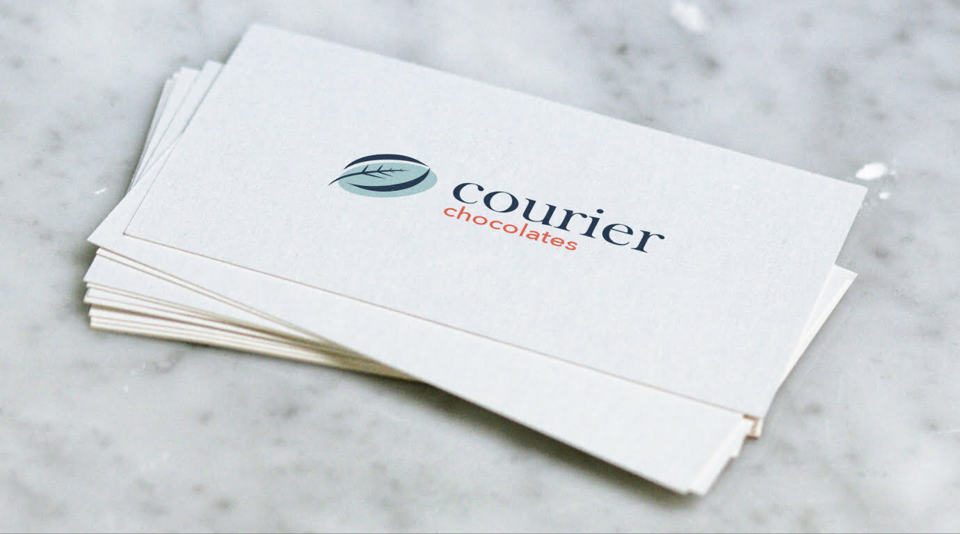
Courier chocolates was presented with a unique mark that utilizes the overall shape of the cacao bean and includes a leaf element within the negative space to project the idea of clean and fresh. Baskerville and Avenir were used in lowercase with the mark paired with a primarily blue color palette to provide a softer overall feeling.
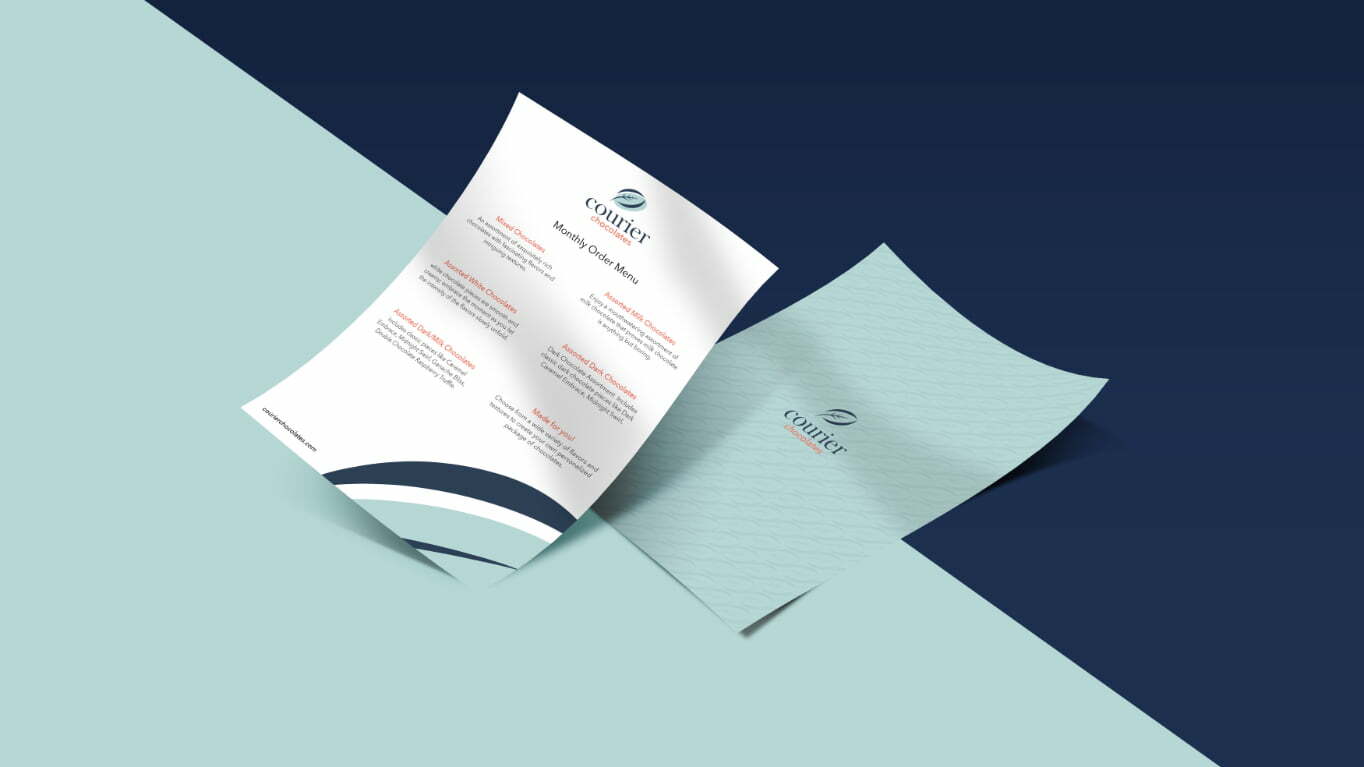
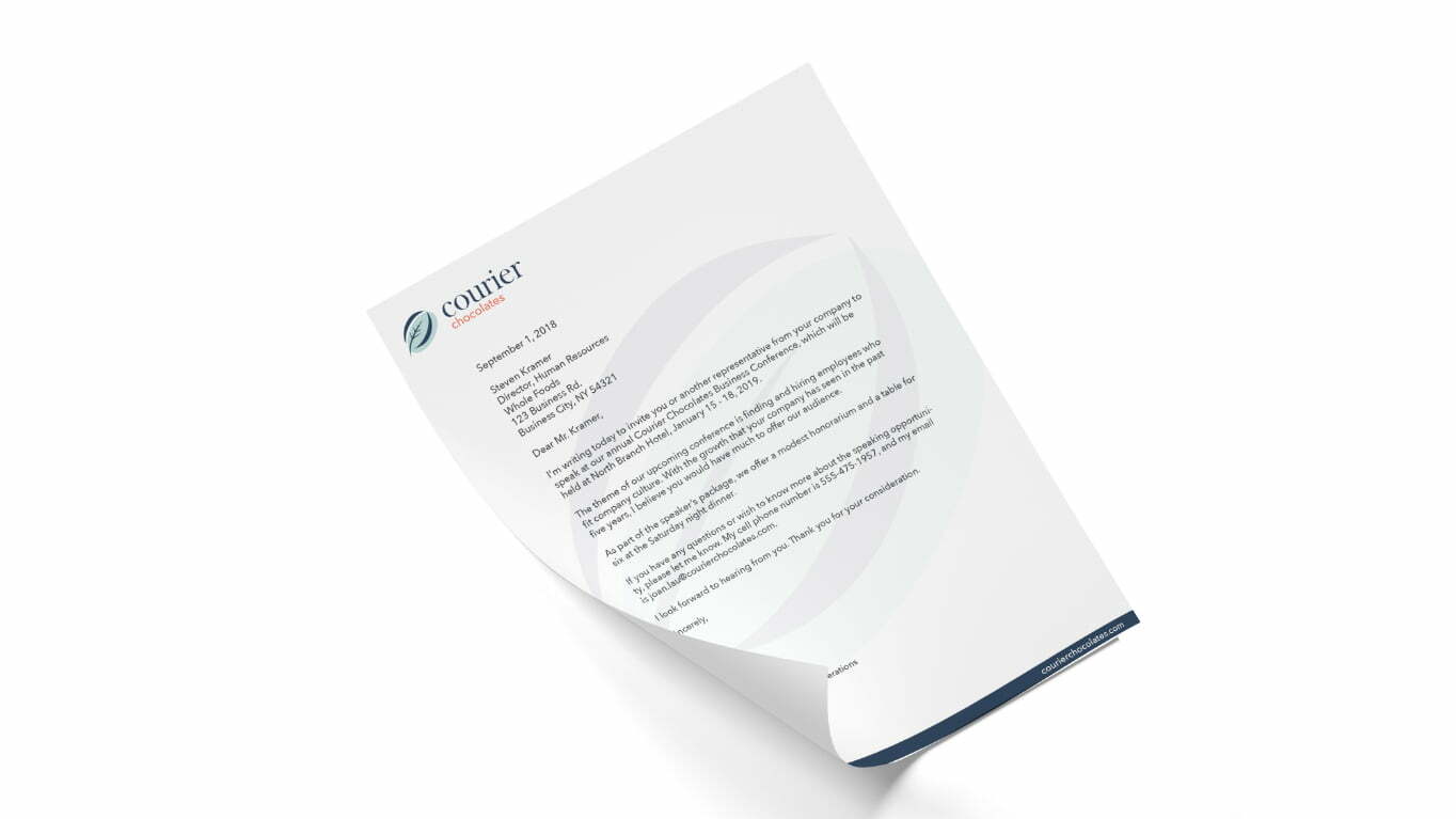
This design language was then translated to all stationery elements and uses the overall shape of the mark in some places to balance the pieces while also creating some visual interest.

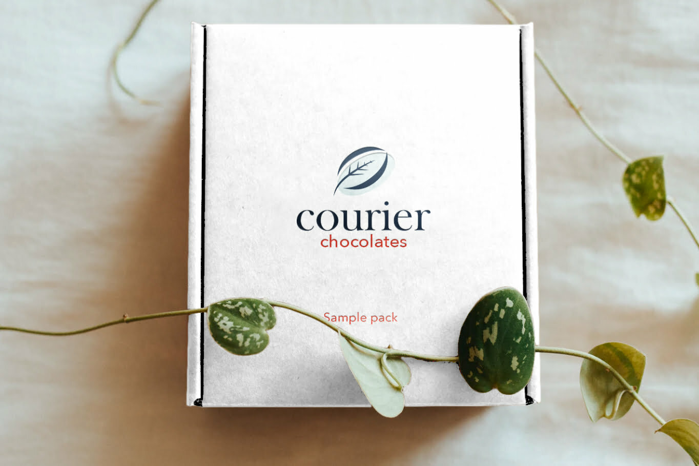
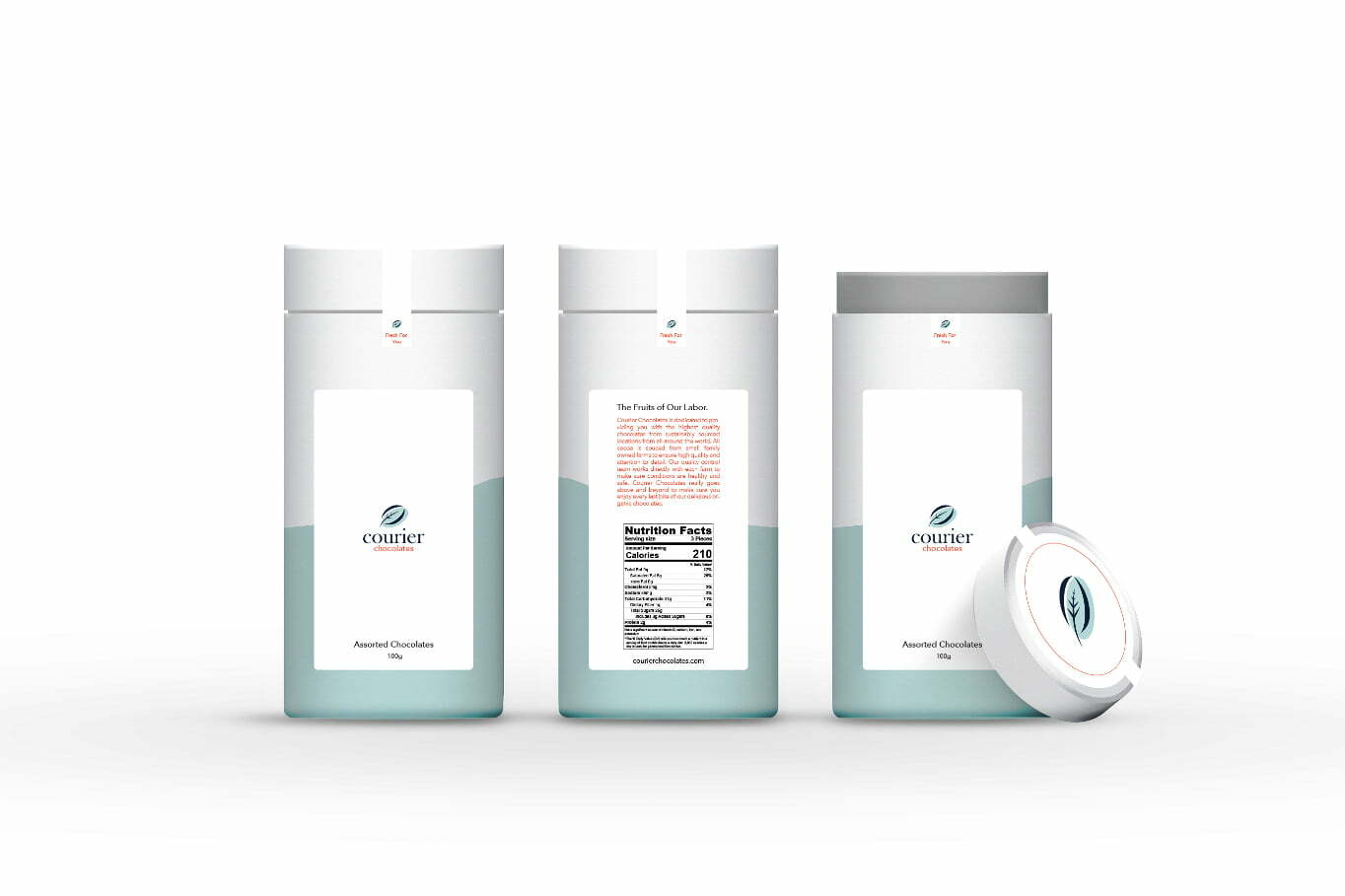
Each monthly package is delivered in a box containing 2 tubes of carefully curated chocolates based on the customer's flavor preferences. The tube has a light blue design element pulled from the logo mark, and has a main label on the front paired with an information label on the back. The lids are fastened with a seal to ensure that each package is fresh and has not be tampered with in any way.


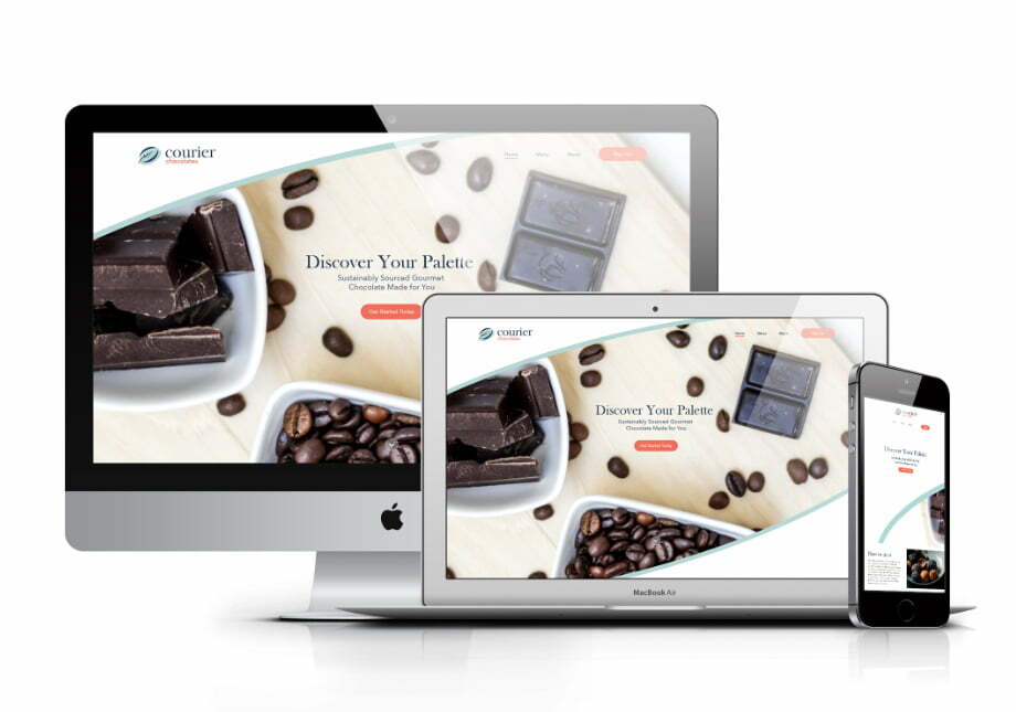
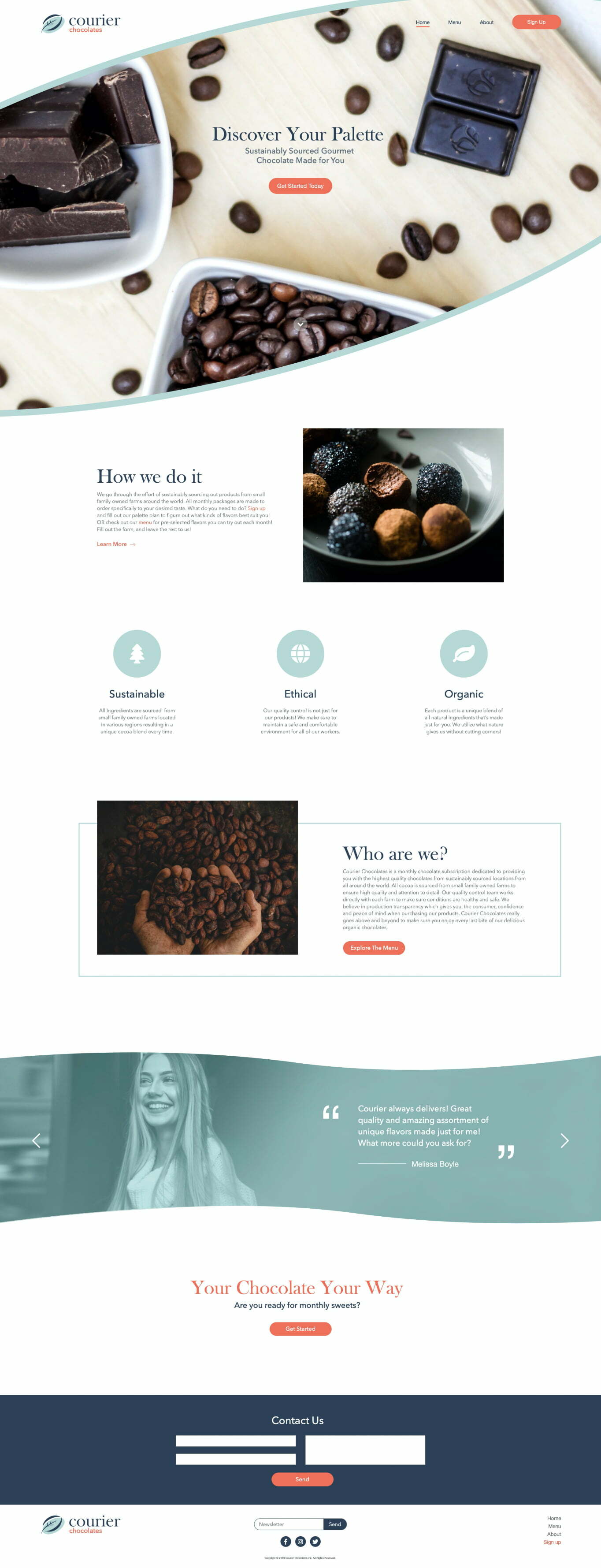
The primary focus of the website was to influence sales. This was done by providing a fresh, clean, design making use of direct calls to action throughout.
